
Spiral - A Fine Dining Buffet in Manila
CLIENTSpiral Manila
PROJECT BRIEFCreate a website for the client & add features that will increase visitors & engagement on the page.
DESIGNED FORCarbon Digital, Inc.

This was originally started by my then-superior, Mr. Carl Laurino, until he ended up letting me take the reigns for this project. I’ve only been to Sofitel a couple of times & it definitely didn’t get its 5-star rating by chance! Sofitel has many features, but the most famous one is definitely Spiral – their buffet. With so many different cuisines to choose from, you just can’t go wrong!

If I reckon correctly, the slanted sections were introduced by Sir Carl to the layout before I had gotten hold of it. Using that as a basis, I began sketching the layout & the would-be content on paper. We wanted people to not only book their reservations within the site but also to have more information about the buffet itself. The original main color scheme: gold & purple – based from their logo, however, the client wanted that changed so we ended up with a black marble instead of the purple.
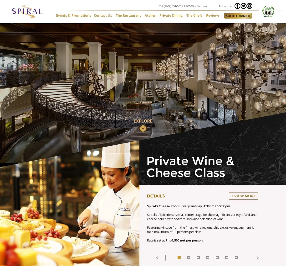
The first thing you’ll see when you open the site is a video showcasing the famous spiral staircase – where Spiral got its moniker, I’m guessing.
Beneath: events, news, lessons, etc. This section is a fully-functioning slideshow, which can house a lot of content.
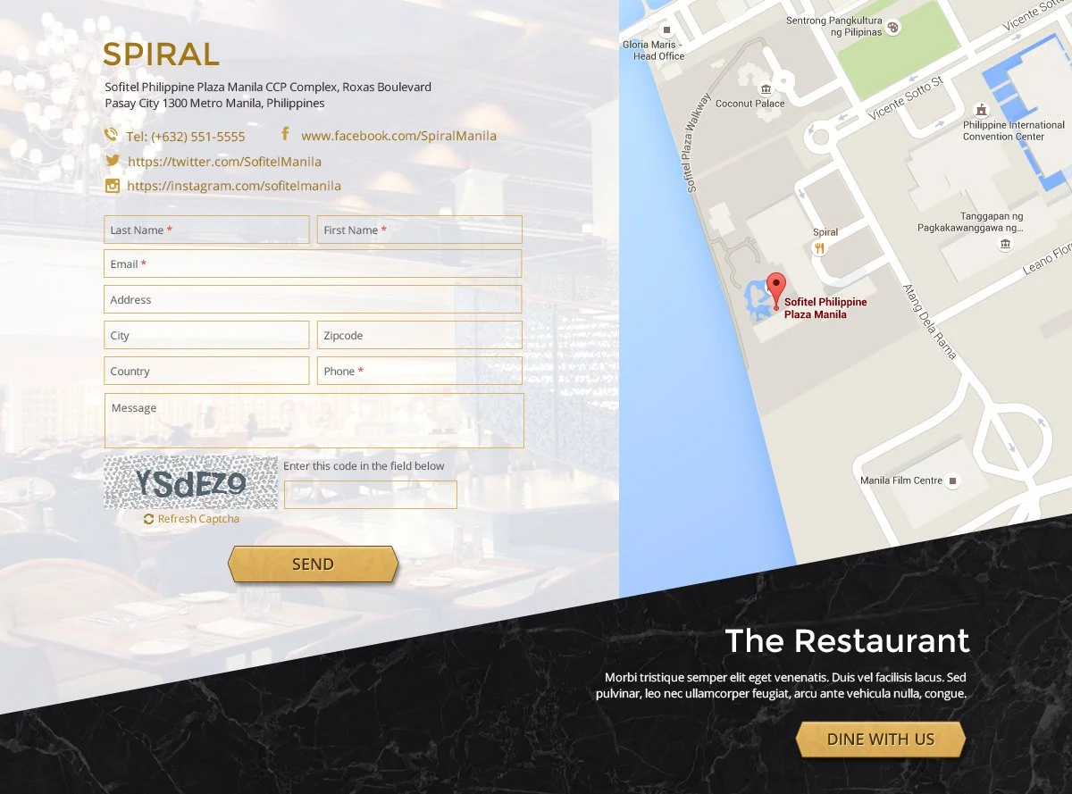
The next section is the contact form & a map. This was supposed to be at the very bottom of the page, but the client wanted it to be placed in the middle, so we obliged.
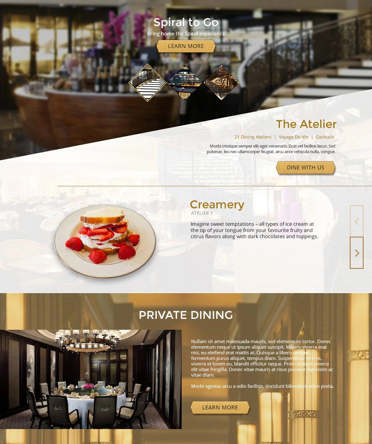
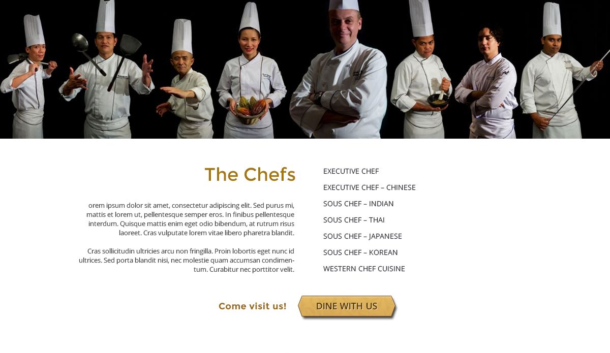
Next few sections mostly show information about dining in Spiral – the restaurant, atelier, private dining, & Spiral to go. Of course, those delicious foods came from somewhere & in the next section, the chefs are introduced!
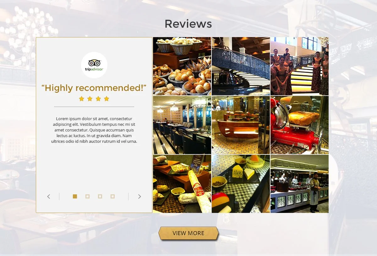
Last but not the least, since this is a dining experience & people like to see ratings of where they want to eat, we added a reviews section. The feed pulls data from Trip Advisor, Twitter, & Instagram.
Main Screens
-
![]()
Top
-
![]()
Location and Contact
-
![]()
Dining Experience
-
![]()
The Chefs
-
![]()
Feed
-
![]()
The Atelier
-
![]()
Feast
-
![]()
Terms & Conditions

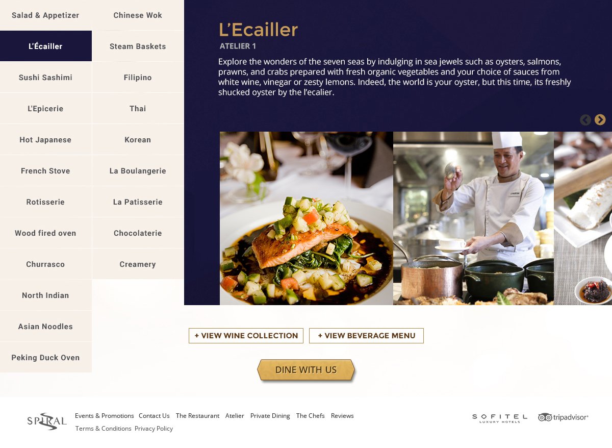
Most of the others pages have mostly the same layout except for the Atelier since the content demands it. That in mind, the first few rows give more insight about the atelier itself. The next section features the different cuisine that the place has to offer.
I decided to make the cuisines clickable with information & photos showing on the right. That way, people like me who’re not familiar with other cuisines can then become more informed & might even deem to try the cuisine out the next time they opt to go to Spirals for lunch or dinner.
Overall: This was definitely one of my favorite projects. I’m no food critic, but I do enjoy eating great food every now & then & Spiral does not disappoint! I always love designing websites in line with food or about food itself!