
San Mig Light
CLIENTSan Mig Light
PROJECT BRIEFImprove and/or modernize San Mig Light’s old website – still using the same light mapper concept & to make it mobile-responsive. Additionally, provide a feed of content for users wherein they can use the site to be more updated about the happenings in the metro & to be able to check through lists of bars & clubs.
DESIGNED FORCarbon Digital, Inc.

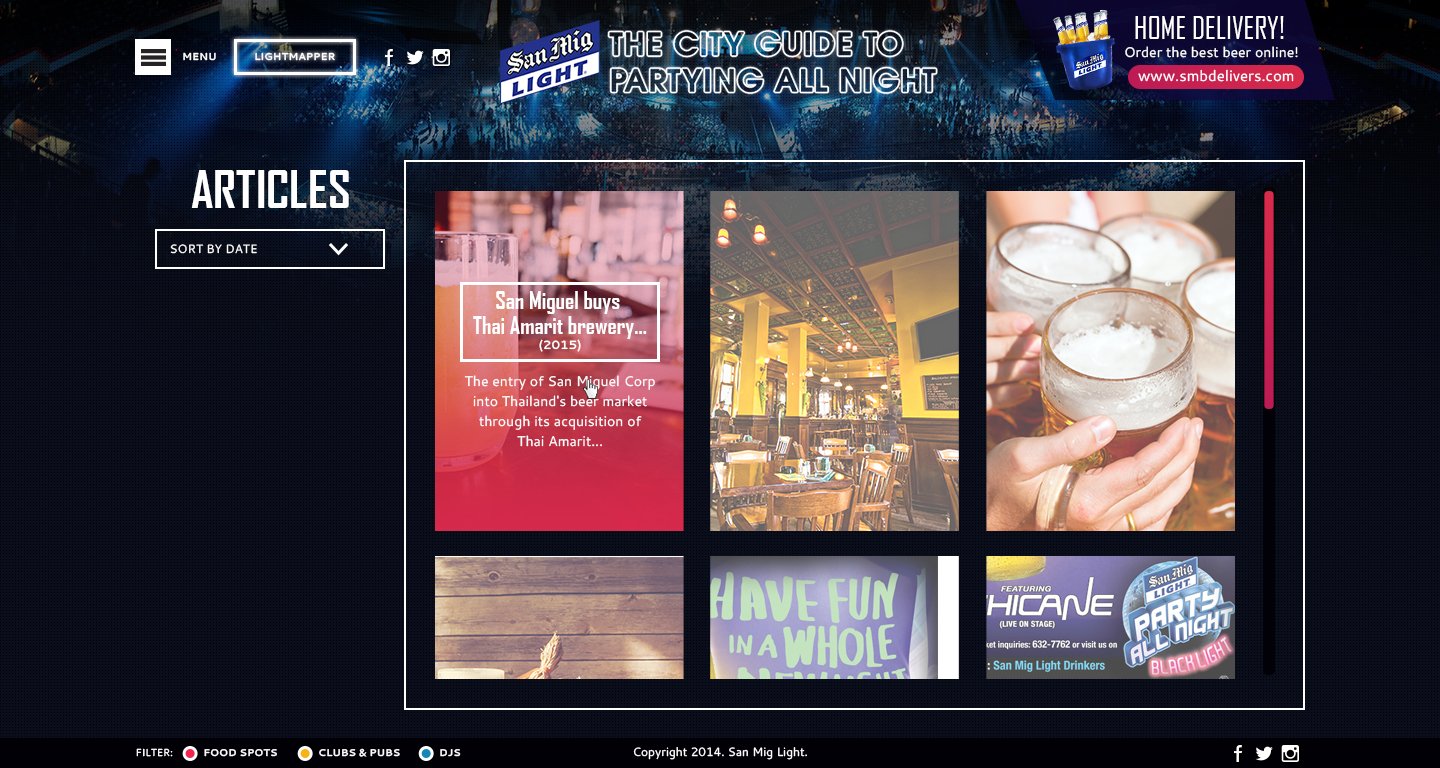
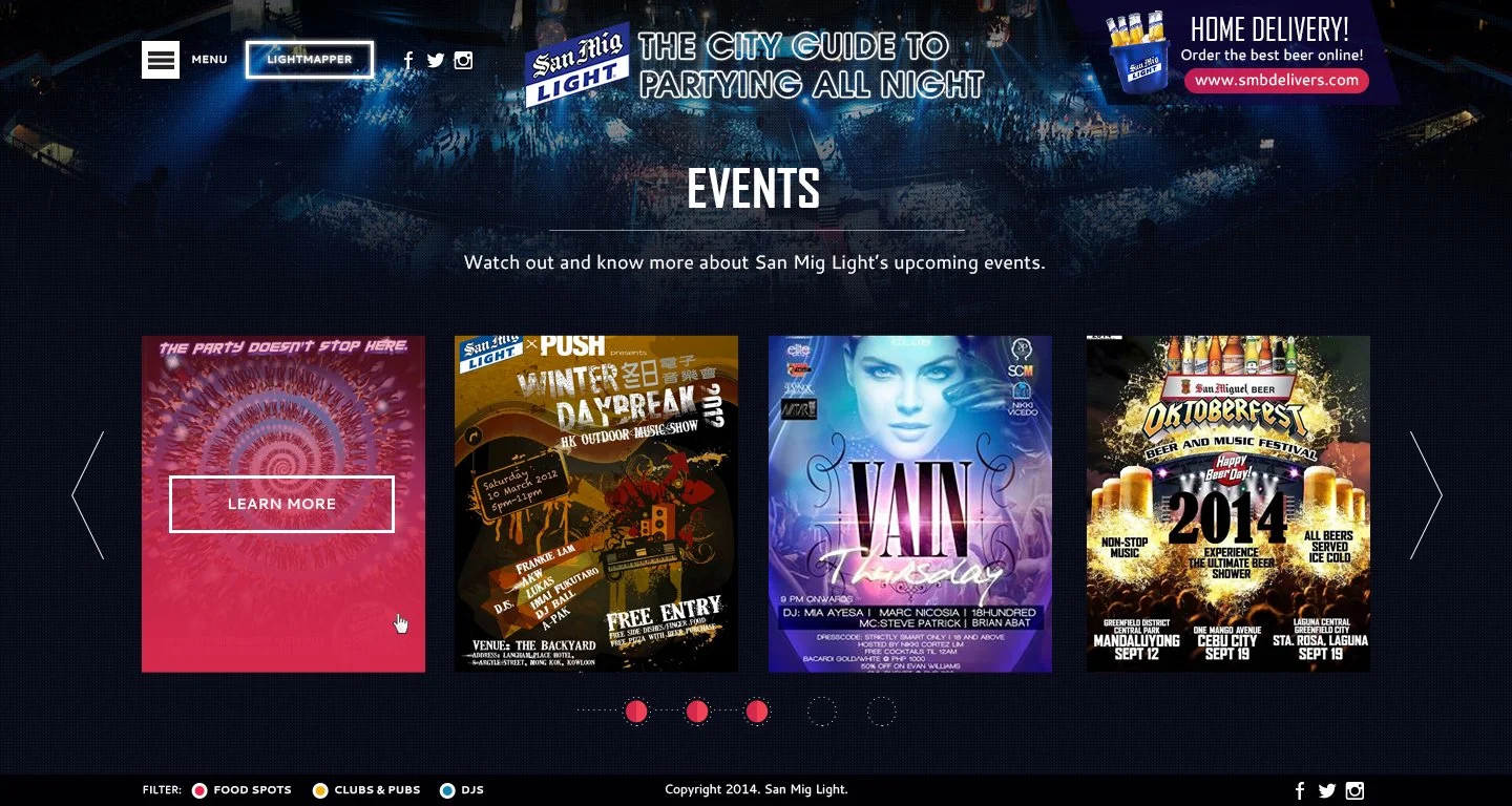
The site was also created to update viewers about the brand’s events, tvcs, promos, etc.
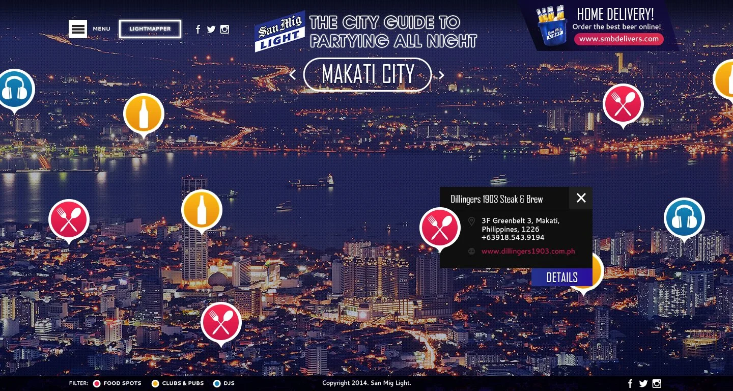
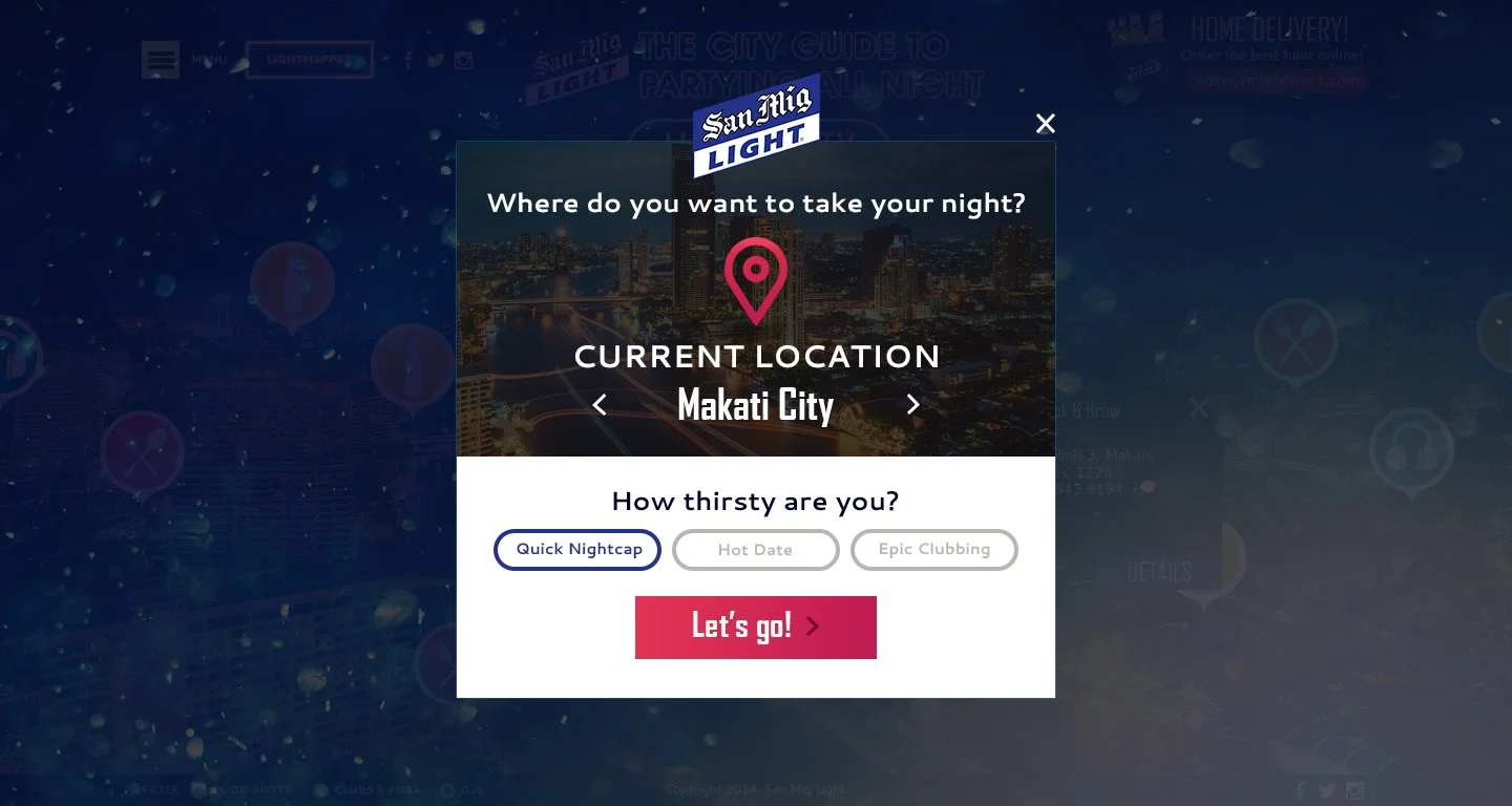
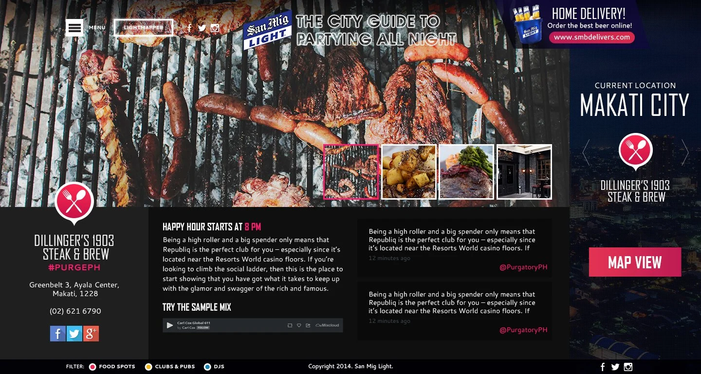
The light mapper became the focal point of the entire website with a skyline photo of a city (photo should change per city) as the main background. Adding to this: a pin for locations of bars, clubs, etc. were placed on top as a sort of map. This can be filtered at the bottom in case the user only wants to get information on clubs & nothing else.
Clicking or hovering on a specific pin will show a brief excerpt of the place & clicking on “more details” will pull an entire slide dedicated to providing details & photos of the selected pin.
Note: More details page was originally designed by Ms. Jess Limcangco and some others were made by Clang Laurea & Gretch Fuentes.

Overall: This was a good break from my usual long parallax sites. I wanted to make it interactive, fun, yet also simple since the target market bracket for this particular website was pretty wide. That said, I didn’t work on this entire site alone! Some of my then-juniors, including Clang Laurea & Gretch Fuentes, worked on this project with me & it was quite a new experience considering that this was one of our first big clients!
As always, you learn from every design you make & in this particular project, I learned a lot – specifically, regarding the mobile responsiveness of the entire site. I had to think of what everything will look like on the tablet or phone. Mobile first wasn’t a thing yet so it took a bit of a struggle to “downgrade” everything to fit the phone’s screen. Thankfully, I didn’t necessarily put a lot of items in most of the pages so it was easy enough to fit everything
Main Screens
-
![]()
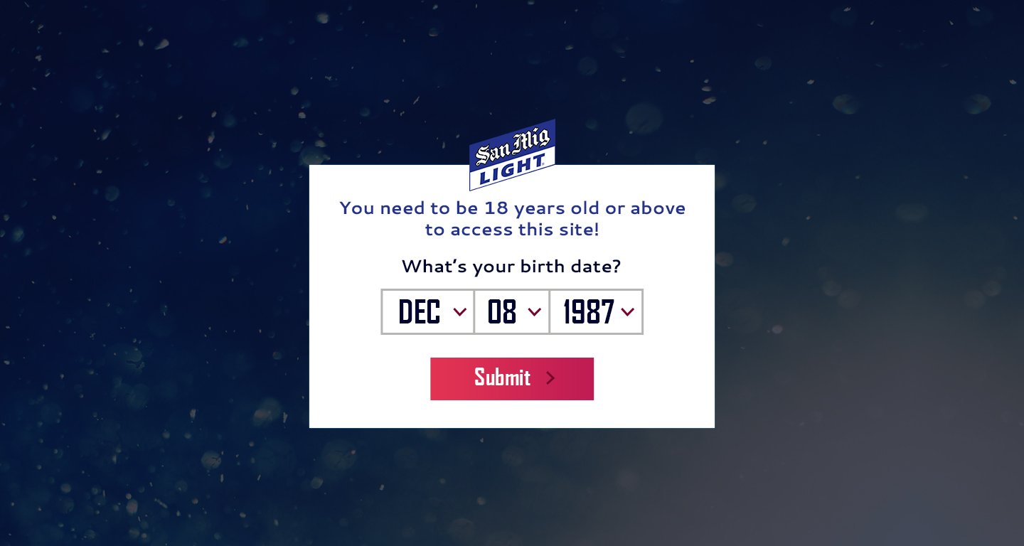
Age Prompt
-
![]()
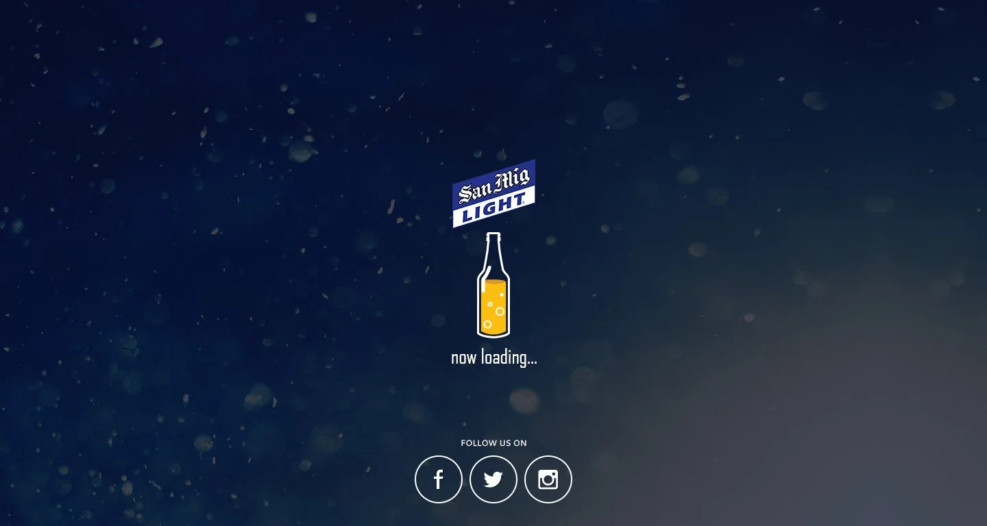
Loading
-
![]()
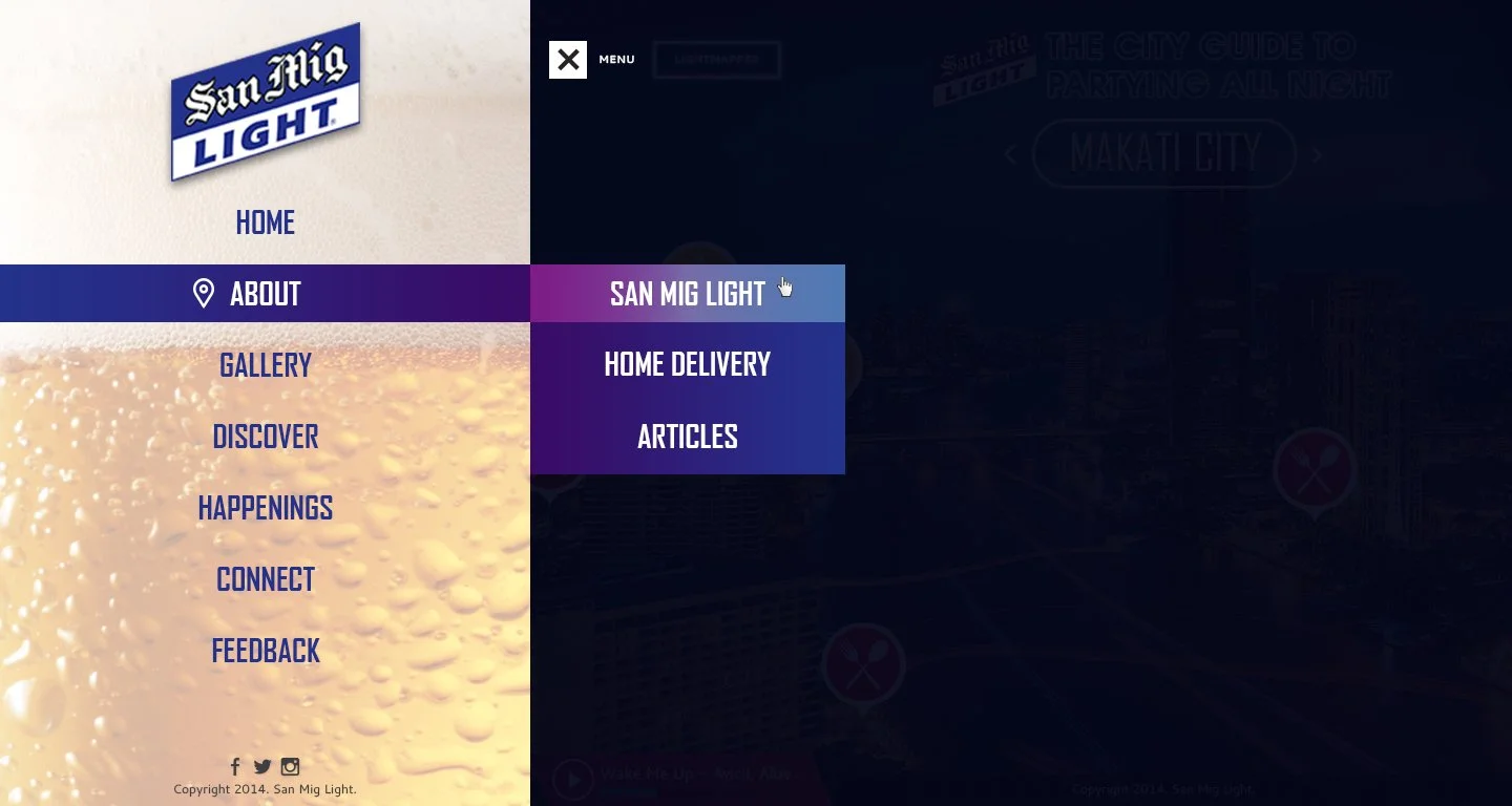
Navigation
-
![]()
Home
-
![]()
Location
-
![]()
Restaurant
-
![]()
Articles
-
![]()
Events
-
![]()
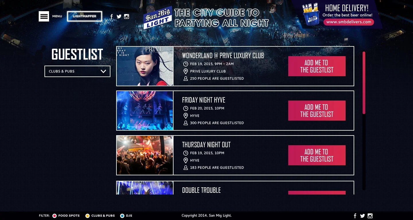
Guest List
-
![]()
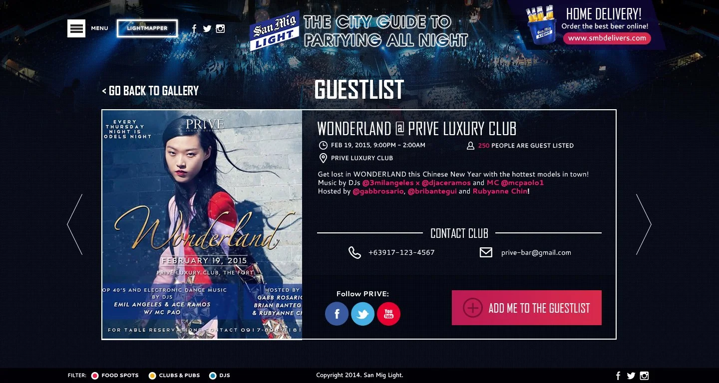
Guest List Inner
-
![]()
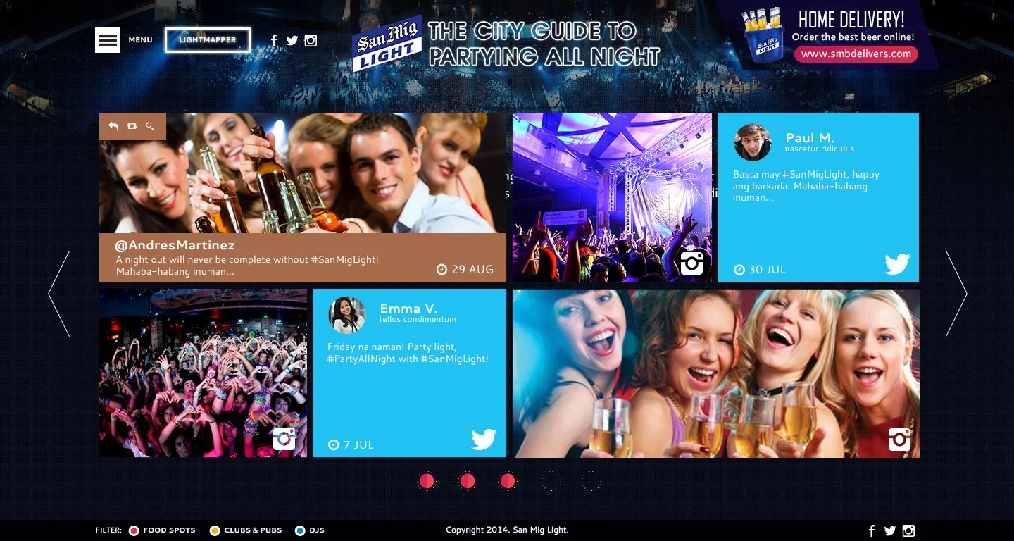
Feed
Mobile-first wasn’t a thing yet, so it was a bit of a struggle to “downgrade” everything to fit the phone’s screen. Thankfully, I didn’t necessarily put a lot of items in most of the pages so it was easy enough to fit everything on smaller monitors.